
 Prints and patterns are essential elements in styling a dynamic, sophisticated, and personalized home. A room without prints is like a room without artwork, plants, or personal effects. It can feel one-dimensional, flat, and unlived in – more like a hotel room than a true home.
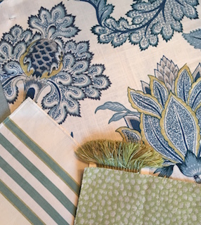
Photo: The key to mixing patterns is scale and color. A large scale floral works well with a medium scale stripe and a small scale animal print. The blue-green color scheme ties them all together.
Through trial and error and a decade of playing with fabric swatches, I’ve come to determine that though there is no hard and fast rule for mixing patterns, there is a simple framework that makes selecting complementary prints a breeze. What’s the trick? Contrast your patterns’ scales, styles, and textures, while linking your patterns through color. Following these flexible guidelines will enable you to mix and match all manner of patterns like a pro!
Most rooms can handle at least three patterns, if not more. The key to finding patterns that complement one another, rather than compete, is to vary the scale of each. One large pattern + one medium-size pattern + one small, tight pattern is a tried and true formula that will ensure your prints aren’t fighting with one another for visual dominance.
Though your patterns needn’t be matchy-matchy (in fact, I hope they are not), they should all have a few colors in common. Select your first pattern by finding one that incorporates your room’s overall color scheme. Whether it’s a large, splashy floral or a tiny multi-colored stripe, find and commit to a pattern rooted in your signature color-scheme, and use it as the jumping-off point for finding your other prints. Select one or two accent colors within your signature pattern that you’d like to emphasize. Then search for other scale prints that include those accent colors.
Next consider the style of your patterns. I like the contrast of a fluid, free-form pattern next to a more structured, graphic print. Try a loose, curvy pattern like a floral, paisley, medallion or abstract print as your large-scale pattern, and offset it with a more structured medium-scale stripe or check. Then tie the two together with the small-scale all-over pattern like a leopard print, ticking stripe, or polka dot. The yin and yang of a loose print playing off something more ridged will draw the eye and prevent a room from feeling too saccharine or contrived.
Finally, vary your patterns’ textures for added dimension and tactile interest. Try using three or four types of fabric in a room or when pulling together a group of accent pillows. Linens, needlepoint, velvet, silk, metallic, and leather can all happily cohabitate on a sofa as accent pillows or throughout a room as various upholstered pieces and window treatments.
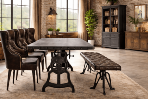
If you’re nervous about investing in patterned upholstery or drapery, begin your quest to mix prints with less expensive accessories like table linens or accent pillows. The dining table is a fabulous spot to try your hand at layering patterns without committing to a permanent look. Try mixing three prints via a tablecloth, runner, and dinner napkins. Chances are your dining area already houses a patterned rug, so get the mix right, and you’ve mastered 4 prints at once! Move on to throw pillows for the Guest Room bed or the Living Room sofa. The more you practice mixing prints, the sooner you’ll realize just how much zest they’ll breathe into your home.
Kitty Burruss is an interior designer, wife, and mother known for mixing prints in both interiors and her daily wardrobe. Her four-year-old also delights in mixing vivid, colorful patterns – especially those involving pink, purple, and well-known Disney characters.