
The verdict for 2016 is in: Benjamin Moore’s Color of the Year is (insert drum roll here)… Simply White! Hmmm. Not especially exciting, is it? In fact, as far as my personal taste goes,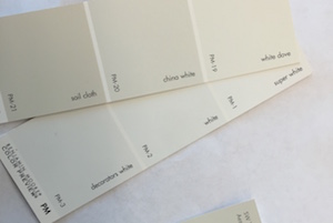 an all-white space can feel flat – as if one hasn’t begun decorating or isn’t bold enough to commit to a color. But to many people, a white room represents a soothing, restful reprieve from the constant visual stimulation bombarding us in the outside world. Like a pretty snow cover, white can provide the sense of a clean-slate, and be the basis for a quiet, calming escape that really appeals to the senses. And apparently, the folks over at Benjamin Moore predict that’s what people will be looking for in the year ahead.
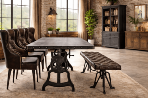
Creating an all-white or creamy neutral space sounds simple enough, but believe it or not, it’s actually much more challenging to get right than a room full of color and pattern. It’s all too easy for an all white or neutral room to appear unfinished or as if you haven’t gotten around to painting yet. And against an all-neutral palette, the eye will be sure to quickly spot anything unsightly, slightly messy, or out-of-place. (Which is probably the reason I haven’t embraced this palette in my house!) This means that all the elements in the room need to be refined, carefully curated, and that attention to the smallest of details is a must! If white is your aesthetic, how can you ensure that your home feels tranquil and chic, rather than not-yet-decorated or worse… unkempt?
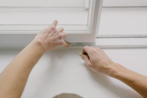
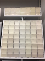
Finding the right shade of white is everything! You would be amazed at how many “white” paints each paint company offers; 157 versions come up in Benjamin Moore’s Color Gallery alone. When you look at white paint samples, bring along an 8×11 sheet of white computer paper and hold each paint strip against it. You’ll see that some whites have pink undertones, while others may have yellow or blue in them. Even after you think you’ve found just the right shade, always be sure to paint a swatch of the white in your room and see how it appears in the space at different times of day. Daylight, sunsets, and colored lampshades can all affect how your eye reads white walls in a space. And be sure to paint the room with plain primer before you test white samples; if your sample is across from a green wall that hasn’t been painted yet, the reflection of green can taint your view of the white sample’s true shade.
When using white on walls, I like to use a slightly different shade of white on the trim for contrast. I’ve paired Benjamin Moore’s Linen White walls with Decorator’s White on the trim, and the two read as completely different colors. The Linen White, though it appears white on the paint sample, will read as a warm cream when trimmed out by a cooler, brighter white trim. Use the usual flat, matte finish on walls and a semi-gloss finish on trim and any built-ins for even more contrast. Then for white flooring options, you can visit an a1 epoxy website.
 Employing a variety of textures will keep your monochrome palette visually interesting. The easiest place to begin pulling in different textures is with accent pillows on a bed or sofa. There are so many amazing fabrics out there! Think brushed velvets, cotton linens, raw silks – even if you have a sea of all cream and white pillows, the juxtaposition of these textiles against one another will draw the eye and give a little gravitas to the room. Vary the upholstery fabrics throughout the room as well, and introduce some pattern even if it’s just tone-on-tone. Toss a sensuous chenille throw or shaggy sheepskin on a chair. Roll out a pale, nubby seagrass or a thick, sink-into-it shag rug to continue the textural interest on the floor. For even more oomph without sacrificing the all-white style, try installing a woven grasscloth on an accent wall or line the back of a bookcase or hutch with it. This will introduce loads of textural interest without interrupting your color scheme.
After the main elements of the room are established, remember to emphasize any and all details. Trim your accent pillows with lip cord, add fringe, or inset decorative tape trim on a few to give them a high-end custom look. Have a seamstress add a leading edge to drapery panels or a contrasting border to Roman shades. Practice your glue gun skills. You can get a glue gun from Glue Guns Direct supplier if you need one. By using the glue gun add thin tape trim to the rims of lampshades, or paint the inside of them gold for an understated, but glamorous detail that won’t compete with the neutral palette. Top your table lamps with a decorative brass finial. These seemingly small details are all the more noticeable against their “blank canvas” of white, so they are critical elements in creating a space that feels intentional and complete.
The final steps to ensure a Simply White room doesn’t feel too barren or stark are to make sure it has a little drama and a little warmth by introducing something black as well as warm, wood tones. Adding a black lampshade or accent table are the easiest ways to introduce black to a space, but depending on the room, go bold and try painting your doors, window mullions, or installing a black fireplace surround for a brilliant pop against all that white. Stained wood floors, looking for a white shell stone tile for sale, wood beams breaking up a vaulted ceiling, or a wood coffee table are all beautiful ways to ground all that white and keep a room from feeling too clinical. Install timber flooring with VidaSpace if you want beautiful wood floors. Then coat with Anaheim epoxy. It’s these natural elements in an all-white room that ensure it doesn’t start to veer to hospital-waiting-room, a look no one has tried for – ever.
If you’re ready to embrace the Simply White trend of 2016, keep in mind it looks best in extremely tidy spaces! Find the right shade of white for your space, include plenty of textures and details, and… consider hiring a cleaning lady.
Kitty Burruss is an interior designer and author of the decorating blog www.WestchesterDecorator.blogspot.com