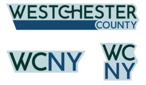
 After more than two decades, Westchester County has introduced a bold new logo, marking a significant milestone in its visual identity and reflecting its dynamic evolution. The rebranding initiative coincides with a mandate requiring the County to transition its webpage from a “.com” domain to a “.gov,” rendering the old logo, which prominently featured the County’s website address, obsolete.
The new logo symbolizes Westchester County’s interconnected community and its enduring commitment to innovation, natural beauty, and shared progress.
Westchester County Executive George Latimer said: “The residents of Westchester County are linked. This connection is symbolized by the hook that seamlessly joins the C and H in our logo. We’re linked by rail, road, and air. By culture. And most importantly, by choice.”
The colors of the new logo were chosen to reflect the County’s rich history and diverse character:
- Columbia Blue captures the County’s prestigious history.
- Dark Green represents the tranquil natural environments that define Westchester’s landscape.
- Indigo Dye mirrors the splendor of the County’s waterways.
Together, these colors create a design that is bold yet balanced, much like Westchester itself.
Westchester County Communications Director Catherine Cioffi said: “This new logo is more than a fresh design—it’s a celebration of who we are as a community. It reflects Westchester County’s identity as a place of connection, innovation and unity.”
The County worked with Joy Riot to create the logo. The launch of the new logo is part of a comprehensive rebranding initiative. Residents can see the new logo displayed across County websites, signage, and communication materials as the transition takes place in the coming months.


