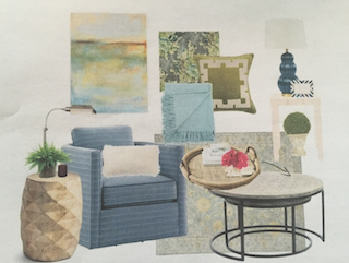
 Creating a cohesive color story is perhaps the most impactful – and fun! – step in crafting a thoughtful, beautiful home. A well-planned color scheme visually links one space to the next and provides a home a sense of premeditated flow, regardless of its layout. It narrows down the myriad of furniture and fabric choices out there by allowing us to emphasize a few favorite shades in each room. Photo: Using the Seascape painting (upper left) as inspiration, the designer crafted a color palette of soft blues and greens with a touch of chartreuse for this restful sitting room.
But perhaps the most powerful element of a color palette is its ability to affect our emotions and our mood. Designing a home around the colors you love and the feelings you want your rooms to evoke will result in that genuine sense of “coming home” each time you walk through your door.
When deciding on a color palette for a client, I typically begin with a piece he wants to incorporate into the space such as an heirloom rug or a favorite piece of artwork. Once we identify the colors the client is drawn to within the piece, we’ll focus on what type of mood he’d like the room to evoke. We determine this by discussing when and how he uses the space and the type of lighting it has or needs, as light can drastically affect how we see colors. Is our goal to create a sense of calm serenity in a Master Bedroom, generate uplifting energy for early morning cups of joe in a Breakfast Nook, or set the stage for intimate conversations and cozy movie nights in a Den? The mood we want to capture will help narrow down the tones of the colors we pull from the “inspiration piece.”
For instance, if we need to use an inherited Oriental rug composed of reds, deep burgundy, and navy blue as a jumping off point for a room’s color palette, I’ll first determine if the client is mostly drawn to the blues in the rug or to the reds, plums, and burgundy. Once I know the client prefers the blues and burgundy over the more vivid red, we’ll determine which shades of blue to play up based on how the client uses the space. If we’re working in a dimly lit Study mostly used for TV viewing, we may decide to envelop the room in deep shades of peacock, teal, and navy, giving it a decidedly nighttime feel, and then layer in warm touches of well-worn leather and deep burgundy to amp up the cozy factor.
If the same rug is to be featured in a light-filled space where a young family gathers to build Lego castles, have impromptu dance parties, and display original crayon drawings, we might instead pair it with a crisp white walls, a stain-proof navy blue sofa, and some bright coral pillows (a spin on the rug’s red tones) to serve as a clean and lively backdrop for all of the colorful toys, dress up clothes, and family photos that are sure to find a home in this type of room.
Place that same rug in a formal Dining Room with rich eggplant-hued walls, a gilt-framed mirror, and chairs upholstered in a sumptuous navy velvet, and you’ve just created a dramatic color combination ideal for elegant celebrations and romantic candlelit meals.
One rug, three different color palettes and corresponding moods.
These examples also illustrate how using similar colors in a variety of tones from room to room can provide a real sense of continuity without tying you to a single palette. In this case, Navy acts as a basic neutral and appears in each room, while the various shades of plum, burgundy, and coral pop up depending on which one best suits the mood of the space. And since the client preferred the blues and burgundy tones over the red in the rug, we were able to avoid emphasizing that color all together. Just because a color shows up in your inspiration piece, doesn’t mean you have to embrace it.
If you don’t have a piece of inspiration to use in determining your color palette, there are a myriad of ways to find one! Many people ask where I look for color combination ideas, and the answer is – EVERYWHERE! I have an entire Pinterest page devoted to color palette ideas, and it’s composed of everything from greeting cards to floral arrangements, art prints to colorful scarves, china patterns, and even street style photos of people’s outfits. One of my personal favorite color combinations is to pair a muted coral-toned taupe with deep moss green, and it’s because that combination resembles the gentle patina on the historic homes of Savanna, one of my favorite cities. Think about your ideal vacation, your favorite outfit, or even a cherished pastime like walking the beach or watching the sunset, and try infusing your home with the colors that bring those beloved images to mind.
Kitty Burruss in an interior decorator, wife, and mother who loves helping clients embrace color.
Follow her at www.WestchesterDecorator.blogspot.com.


