Myth 1: It’s less expensive to recover your sofa than to buy a new one.
Nope – it’s usually not. Unless you plan to buy your sofa at Ikea, Bob’s, or another discount furniture store, it will typically cost about the same to reupholster your current sofa as it will to purchase a new piece. You’ll need at least 7 yards of fabric for a fully upholstered chair and up to 20 yards for a sofa with loose cushions. Fabric ranges from $35-$150 a yard and up, so the fabric alone to reupholster a sofa can easily cost $1000. Add in the price of a good upholsterer, and you are close to the price of a new sofa.
The one exception to this rule is dining chairs. If the only upholstered part of your dining chair is the seat, it is much less expensive to recover than to purchase new chairs. (Good dining chairs are very expensive for furniture you only use once a month!) You’ll only need around ¾ yard of fabric for each seat, depending on the pattern, so your fabric cost will be considerably less than it would be for a fully upholstered piece. If you have basic drop-in seats, you may even consider recovering them yourself; just be sure to have a strong staple gun and a friend’s help to pull the fabric taut. Or, just buy new timber occasional chairs for a look that’s both modern and casual.
Don’t let this discourage you from recovering a favorite piece! It’s quite common for me to recover a piece of a client’s furniture when designing their space. Sometimes it just fits perfectly into a space, is especially comfortable, or has good lines and proportions. These are all great reasons to recover a piece – and good reason to invest in quality furniture from the start.
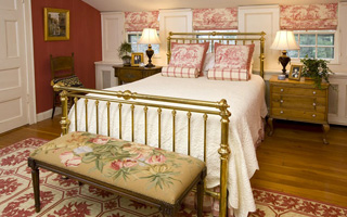
Myth 2: Bedside Tables should match each other and, preferably, be part of a bedroom “set.”
While there’s absolutely nothing wrong with having matching bedside tables, there’s certainly no rule that they be identical! While I like to aim for a sense of symmetry and balance in my designs, I can achieve this by using pieces of similar height and proportion. A writing desk and a skirted table can look balanced if they’re of similar height and sport matching lamps. If you have two pieces of similar height and are striving for more consistency, consider painting them both the same color.
Even when we use matching bedside tables, no decorator has ever recommended a bedroom “set!” Using a variety of styles and finishes in your furnishings is what makes a room sophisticated, chic, and personal, as opposed to looking like an advertisement in a furniture catalog. So mix and match and work with what you have!

Myth 3: Dark rooms should be painted light colors.
So many clients ask me about this. They are all so accustomed to believing that every room should feel large and light, that it’s common for them to want to somehow fight or change small or dark spaces by using light colors. While you can’t ignore the physical characteristics of a space, like low ceilings or a general lack of natural light, it’s just as important to figure out what mood you want a room to have. I believe a room’s color palette should be determined by who will be using the room, how they will be using the room, and most importantly, how they want to feel in the room.
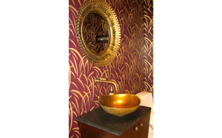
If the room in question is one you want to retreat to and relax in at the end of the day, I like to accentuate the darkness and create a cozy cocoon-like effect by using rich, warm colors on the walls like chocolate or deep red. In Powder Rooms, often the darkest room in a home, I like to create a little drama with deep unusual shades like eggplant or navy. You’re not in this room that often, so it’s great space to go bold without fearing that you’ll tire of it quickly.
But what if the dark room is a room you’d like to be bright and energized, like a child’s playroom or the kitchen where you have your morning cup of coffee? Pale, light colors can often be lost and look washed out in a dark room, but that doesn’t mean you have to go for a dark color. Think “saturated” and “bold” instead of “light” and “pale,” when looking for paint colors for these spaces. In a dark playroom, I would use a bright, vibrant grassy green instead of a muted sage. A cheerful turquoise will perk up a gloomy kitchen where a sky blue would likely fall flat. Just pick a color that you like and look for the vivid version of it.
Remember, there are no real “rules” in decorating! The best-designed homes reflect the treasures and tastes of their inhabitants, so paint that dark reading room a lovely, deep burgundy, recover your Aunt Ethel’s dated dining chairs in an of-the-moment ikat, and steer clear of those highly-advertised bedroom sets! (Unless you love one of them, of course!)
For more decorating tips, inspiration, and advice, visit The Westchester Decorator’s blog at www.WestchesterDecorator.blogspot.com.
[blockquote class=blue]Kitty Burruss is an interior designer living and working in Briarcliff Manor. She designs for Barbara Sternau Interior Design 914-631-1875.
[/blockquote]


